It's a "flat design" vector art style inspired by the work of the Memphis Group that's called "Corporate Memphis" primarily by critics. While Hacker News is apparently too sophisticated to be condescended to with simplistic animations that look good at very different resolutions, I think a lot of people like it.
If everyone hated this and considered it "corporate," it wouldn't be the one used by some of the animation studios that create the most popular content (e.g. Kurzgesagt).
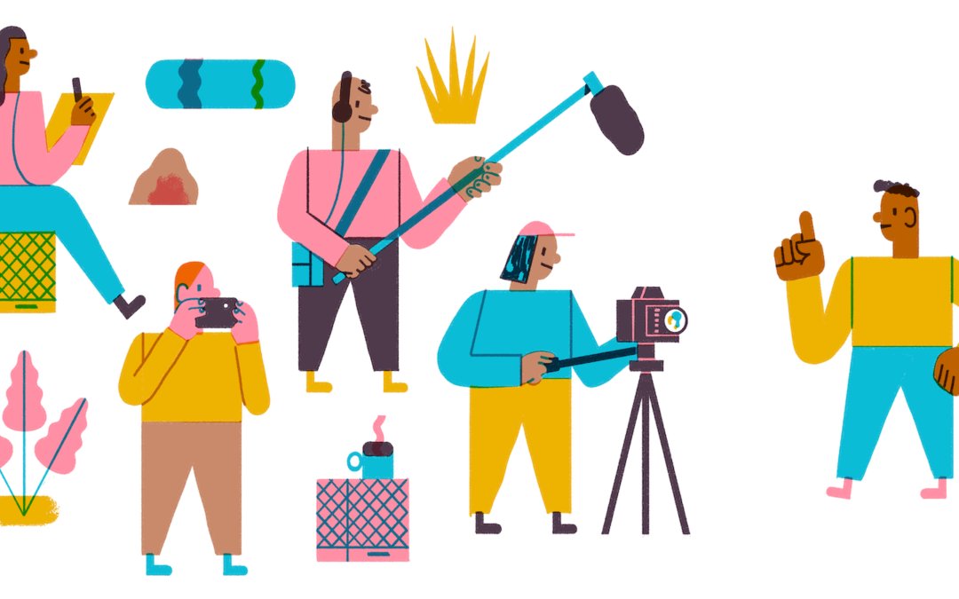
I'm pretty ignorant of design styles, but what always bothered me about "Corporate Memphis", and styles like it, was the very weirdly caricatured humans depicted within it. The people usually look incredibly weird, and while it's not quite "uncanny valley" or whatever, it feels like a very cheap and ineffective attempt at implying diversity. Maybe this isn't the intent at all, but it's most noticeable when there are differently deformed people in the art. People in real life come in all shapes and sizes, but not in the same way, with very bright colors and comically different proportions. As a non graphic designer, I appreciate that such a flat, 2D style may require some unrealistic designs, but as a human, I'm pretty sensitive to depictions of especially unrealistic human imposters. I adore Kutzgesagt, and I think that may be due in part to their predominant use of birds and other animals as agents, rather than strangely proportioned people.
They represent an urbanite 20-something's version of diversity. I appreciate the effort, but I noticed that it rarely represents characters of different ages or styles.
This is very low on my list of grievances though. I like those vector characters quite a bit more than the stock photos they replace.
I wouldn't be surprised if the simplicity of the style made it interesting for constrained budgets and time tables.
Kurzgesagt mentions on its patreon that they used to spend on average 150 hours on each episode and are now at up to 500. While the style stayed mostly the same I think there is now also a lot more going on visually than in the early videos.
I don't think it has anything todo with vectors. Sure general vector art tends to be simpler. What I see is mostly people complaining about empty space, that can be used, and have to access common actions through a menu, also a lot of times no way to add common action like customizable readily available menu ect...
While the uncluttered design for something someone only uses a couple times might be fine to avoid overwhelming someone. If you use it daily and even multiple times a day that can make it harder to use.
It also remind me something i read about a ticket kiosk for some transit system. They updated the kiosk with simpler interface to select various things. While effective for infrequent riders, people who would purchase tickets daily found it much slower because the old kiosk allowed them to type in codes they memorized.
I'd say it started with the mobile web. Lots of space and simplistic interfaces make a lot of sense when you have a small screen and fat fingers. It is terrible on a desktop but since people want a unified experience, to keep things familiar to the user and to simplify development, you get the least common denominatior.
I'd say that the "flat" trend was started by Microsoft with Windows Mobile and Windows 8. Apple and Google followed (for once Apple didn't start the trend). I liked it at the time, maybe for the novelty, but it quickly faded. Still I understand why people may like it.
Why would I want a unified experience between desktop and mobile, when input methods are completely different? It's kinda like using a bicycle handlebar to steer a car.
https://www.imgur.com/DcL05OA.gif
(This could be a subset of infantilization, since this art style seems to come from books for toddlers.)